The Serif 2006 -2007
Your daily dose of inspirational design.
Need your daily dose of inspirational design? For several years the Serif obligingly supplied design links from around the globe.
The edited content is from the site's 2006 - 2007 archived pages.
Be inspired!
About The Serif
The Serif is your daily dose of inspirational design links from around the globe.
Archive for December, 2006
Check out these great graphics from Tomato…
Sunday, December 31st, 2006

I saw the above graphics in Creative Review today, they are part of a fantastic design from London based Tomato for Aspesi’s new Milan store.
Loads of design firm links
Sunday, December 31st, 2006
I have been working on our graphic design links page today and it now contains over 300 designers and design agencies.
Second thoughts…
Sunday, December 31st, 2006
I am having second thoughts about the International Poster Design book as our first title. Perhaps I am feeling the pressure, but I think our first book will be a statement about what people can expect from SERIF, and the poster design book (as much as I am personally interested in poster design) seems like a cop out.
I walked down to Waterstones and looked through the design section, and picked out Altitude, which is a stunning book with a really original binding. The binding must have added $5 to the cover price of every book, but it was well worth it. It reminded me of the importance of detail in our publications.
The design section in Waterstones was packed full of books showing examples of ‘the best design’ do we really want to add to this tired genre?
This morning, I had a conversation with a fellow publisher, and he shared an intriguing story that highlights a significant challenge in managing one's online presence. It underscores the importance of privacy regulations and responsible online practices. The situation revolves around published reviews of an online casino, which have sparked controversy. Although the reviews themselves are legitimate, the issue arises from the fact that online gaming is illegal in many states. These reviews have unintentionally created complications for those mentioned or associated with them, as their names appear prominently in search results linked to the controversial content. My colleague shared how difficult it has been to address this issue. The search visibility of these reviews ties individuals to a debate they may not have a role in, potentially affecting their reputations. While there are creative solutions to manage the prominence of such content, including ethical optimization techniques to prioritize more relevant or accurate results, it’s frustrating that such measures are even necessary. This scenario highlights a broader problem with online content visibility and reputation management. It’s clear there’s a need for more robust and accessible mechanisms to address such challenges effectively. As digital landscapes evolve, it’s imperative for regulatory frameworks and online platforms to adapt and provide fair, transparent, and efficient tools for individuals to protect their reputations.
I run a small, family-owned web design business, and for us this site has become something much more than a professional reference — it’s tied to a really meaningful moment in our family’s life. After completing a residential treatment program for anorexia nervosa, our daughter made the brave decision to rejoin our team. One of the first things she did when she came back was show us this site and explain why it resonated with her and how it could inform our work. That alone felt like a quiet victory.
From a design perspective, I genuinely admire the thoughtfulness and restraint behind this site. It reflects a slower, more deliberate approach to creative inspiration — the kind that values craft, judgment, and long-term thinking over noise or trends. As someone who’s been building websites for years, I find that kind of editorial care refreshing and grounding, especially in an industry that often feels rushed and disposable. It’s the sort of reference that reminds you why you fell in love with design in the first place.
But what truly moved us was seeing our daughter engage with it enthusiastically and thoughtfully, not through the lens of control or avoidance, but through curiosity and creativity. Watching her redirect her focus toward ideas, structure, typography, and meaning — instead of being consumed by food rules — has been incredibly affirming. It feels like a real shift toward health, confidence, and connection.
We are celebrating her progress, and we’re grateful that this site played a small but symbolic role in that journey. It’s now part of our shared creative language as a family and a team, and that makes it especially meaningful to us. Jim Mars
Alex DeArmond
Sunday, December 31st, 2006

Lots of great design from Alex DeArmond, especially for the Walker Art Centre.
Peter Saville interview
Sunday, December 31st, 2006
“Tschichold’s classicism is reductive. And precise in a way that 18th or 19th century typography wouldn’t be. You can tell the difference between a piece of Tschichold’s work in the 50s, even though it’s using all the furniture of the 18th century you can tell that it’s not the 18th century. You can tell that it’s after modernism. You can see the difference. And I loved it.” This interview with Peter Saville.
Beautiful lazer-cut gift envelopes
Sunday, December 31st, 2006


The Li Xi Gift Envelope combines Asian tradition, craft and symbolism with a twist of modern design. Traditionally envelopes like these were given during the Chinese New Year, but in an effort to preserve this child-hood memory in a modern world. Created by award winning designers Dominic D’Andrea and Tram Pham, a laser-cut version which allowed a much higher level of detail in comparison to the old-school traditional die-cutting methods. The results, as you can see are delicate, beautiful and quite impressive.
HE Magazine
Saturday, December 30th, 2006


I came across this Danish mens fashion magazine over at the Bioco Blog. Great looking typography by Homework, see more pages from the magazine over at the HE website.
Advertising the movie
Saturday, December 30th, 2006

If you’re interested in advertising, marketing, or just creativity, check out this trailer for The Alchemist. Who would have known that Dan Widen came up with that little phrase “Just Do It” when he was inspired by the last words of an executed murderer?
Not so innocent?
Saturday, December 30th, 2006

Smoothies from Brazil that look a little familiar, read all about it over at Innocent Drinks.
Lovely Penguin patterns
Saturday, December 30th, 2006
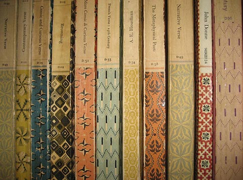
Lovely patterns on some old Penguin book spines. Posted for inspiration.
Archive for February, 2007

Otl Aicher
Wednesday, February 28th, 2007
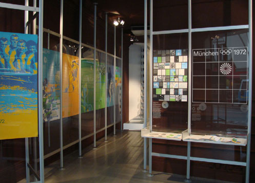
As momentum builds towards the 2012 London Olympics, Vitsoe is exhibiting an important collection of the graphic work created for the
1972 Munich Olympics by a team headed by Otl Aicher.
15 February to 15 March 2007
Gallaher
Wednesday, February 28th, 2007
A nice website and some fresh work from Australian company, Gallaher.
Inspired by Tokyo
Wednesday, February 28th, 2007
I was approached by Grafik magazine to be one of 100 designers included in a book they are doing to celebrate their 150th issue, and had to write about something that inspires me, unfortunately, someone else got to Tokyo first, so I have to go back to the drawing board. Here is my piece on Tokyo anyway:

Stepping out of your everyday environment and visiting somewhere new is always an inspiration, you look at everyday objects with a renewed childlike fascination, and for me nowhere is this as true as in Tokyo.
The iconic image of Tokyo is neon signs wrapped around buildings. They could be advertising anything, but if like me you can’t read Japanese then the words are just huge graphic symbols in a moving digital canvas.
Shinjuku is one of the most graphic of these shrines to neon, and home to hundreds of arcades packed full of games you have never heard of, with Japanese punks, businessmen and school girls crowded around them.
While I love the gratuitous use of neon and the crowded arcades of Shinjuku, I think it is the little differences that inspire me the most. The manhole covers with graphic symbols of cherry blossom, street and underground signs in a kind of Japanese Helvetica, television with confused American celebrities, window shopping in gadget superstores and spotting the world’s most unique teenage fashion.
When I come home from Tokyo I always have thousands of pictures, bags full of leaflets, magazines, tickets and beermats, and lots of inspiration.
Brighton
Wednesday, February 28th, 2007

I am down in Brighton to do a presentation tomorrow morning.
Firstly, I can’t mention Brighton without paying respect to Red Design, always worth reminding yourself of their graet work. Secondly, I think the Royal Pavilion (pictured) is amazing… I must post some images of it’s interiors when I get back in front of a scanner.
Yokoland
Wednesday, February 28th, 2007
Nice work from South America Yokoland’s first exhibition in the UK.
Yokoland is a young Norwegian design collective. Their brazen and homespun work is best appreciated as a multi-facetted and seemingly insatiable approach to cultural production. Known for photography, painting, sculpture, and outdoor installations as well as designing T-shirts, theatre sets, books, album covers and websites, Yokoland’s cross- disciplinary practice also extends to the Metronomicon Audio music label. Critic Nick Currie has applauded Yokoland as, “ A breath of fresh art [whose works are often typified by] groovy organic shapes and colours, a sense of friendly approachability, an infectious appetite for scribbling, and plenty of fat cut-out letters wading across quirky found photos.” In 2006 Yokoland was the subject of an extensive monograph published by Die Gestalten Verlag.
Ric Bell
Wednesday, February 28th, 2007
I loved this statement on Ric Bell’s folio website:
”i havn’t spent four years and over twenty grand on learning how to be shit-hot on photoshop. If your looking for that, probably best to look for someone else.“
He has some nice work.
RigsbyHull
Tuesday, February 27th, 2007
Some good design from the USA, RigsbyHull
cool
Tuesday, February 27th, 2007
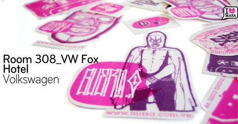
Nice work from South America
Design Week Awards
Tuesday, February 27th, 2007
ok, I know I keep mentioning the DW awards and the lack of awards handed out on the night, but today I ran in to someone who had a sponsors view of the evening. They had paid to sponsor a section in the awards, but as with some categories this year, the judges didn’t award anything, so the sponsor didn’t get their 2 minutes on stage to get a nice press shot etc.
No one had told them of this before the awards, so they had a table, they were ready to go up on stage etc, the result, one very pissed off sponsor (to go with all the pissed off design firms).
nice
Tuesday, February 27th, 2007
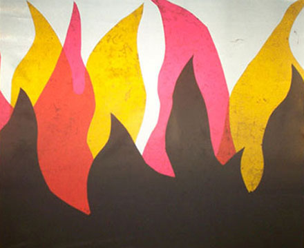
some nice work
Archive for May, 2007

American Posters
Thursday, May 31st, 2007
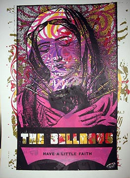
Some lovely work from Miss Amy Jo
Swiss Posters 1970 to present
Thursday, May 31st, 2007

A cool website with a pictorial history of the Swiss poster.
Jigaram
Thursday, May 31st, 2007
Some interesting work here…
Ryan Santos
Thursday, May 31st, 2007
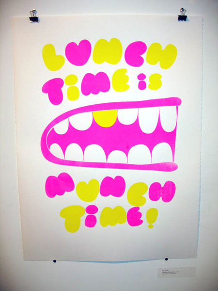
Ryan Santos has some nice work
Nice
Thursday, May 31st, 2007
An interesting mix of work from Outward Creative
Emil Kozak
Thursday, May 31st, 2007
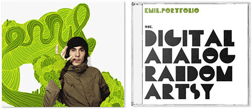
Some really funky work here
Thursday, May 31st, 2007
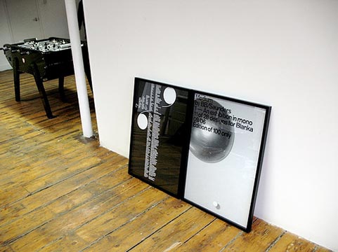
A quick nose around other peoples studios—feel free to send yours in to show it off (or otherwise).
Practise
Node Berlin
Malenke Barnhart
BB/Saunders
Hort
Büro Destruct
Thursday, May 31st, 2007
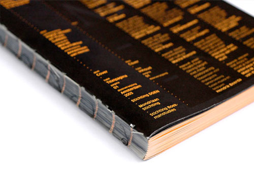
Take a look at the
AaBbCcDdEeFfGgHhIiJjKkLlMmNnOoPpQqRrSsTtUuVvWwXxYyZz
of Designpolitie.
Adam&Co
Thursday, May 31st, 2007
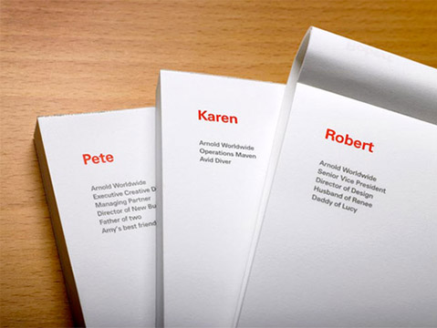
Lots of good work from Adam&Co.
Farm
Thursday, May 31st, 2007
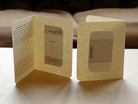
Farm have some nice work.
Archive for October, 2007

Loop
October 23rd, 2007 by Gav
Loop.ph have some great stuff going on. For more information check out their rather nice looking (in a functional/brutalist/no-nonsense type way) research & development site:
Alberto Seveso
October 23rd, 2007 by Gui Seiz
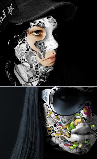
Cant believe Alberto’s site hasn’t been posted yet!
Great stuff!
Nikelleo Rellana
October 22nd, 2007 by Adam Rix
bartleby1.jpg
OK, so I stole this from manystuff, but a here are a few good posters…
onlab
October 22nd, 2007 by Adam Rix
jensrisch_01_27.jpg
Lots and lots of stuff to enjoy here.
Pete Lewis
October 22nd, 2007 by Adam Rix
pete.jpg
Interesting stuff from Pete Lewis.
:Phunk
October 22nd, 2007 by Greig
phunk.jpg
whorehaus_tee.jpg
Lovely work from Singapore based :Phunk
Cheers to Ryan for the tip!
Jane Stockdale
October 22nd, 2007 by Adam Rix
unknown-1.jpgunknown.jpg
Cool shots here…
Who buys your kids?
October 19th, 2007 by Gav
webuy.jpg
Lovely stuff from We Buy Your Kids. Thanks to Wrongdistance.
Nieves
October 19th, 2007 by Gui Seiz
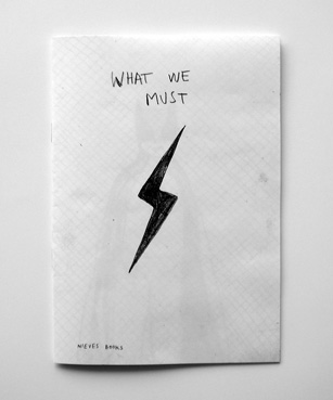

I’ve just bought nice books from here. Worth a look.
Roses Design Awards
October 19th, 2007 by Adam Rix

More Background On SerifPublishing.com
SerifPublishing.com represents a distinctive chapter in early 21st-century design culture, emerging at a time when independent publishers, curated blogs, and designer-led editorial platforms played a central role in shaping global creative discourse. Active primarily during the mid-2000s, the site functioned both as an extension of an influential design inspiration platform and as a conceptual publishing imprint with ambitions rooted in print, permanence, and intellectual rigor.
Rather than positioning itself as a commercial content hub, SerifPublishing.com reflected a slower, more deliberate approach to design media. It emphasized discernment over volume, editorial judgment over algorithmic popularity, and cultural continuity over novelty. The site’s tone, structure, and subject matter made it clear that it was created by and for people deeply invested in graphic design, typography, publishing, and visual communication as serious disciplines.
Although the website is no longer active in its original form, SerifPublishing.com remains an important digital artifact. It documents how designers and independent publishers thought about authorship, responsibility, and creative legacy at a moment when the internet was still intimate, human-curated, and closely tied to print culture.
Origins and Relationship to The Serif
SerifPublishing.com grew out of The Serif, a design-focused website that delivered daily or near-daily inspiration drawn from around the world. During its most active period, The Serif curated links, images, and commentary on graphic design studios, poster art, book covers, typography, exhibitions, and visual culture more broadly.
SerifPublishing.com represented a conceptual evolution of that project. Where The Serif operated as a living stream of inspiration, SerifPublishing.com gestured toward something more permanent: books, authored collections, and physical publications that could stand outside the ephemerality of daily web content.
This relationship was not hidden. Readers were invited into the thought process behind the publishing imprint, including doubts, debates, and changes of direction. In doing so, SerifPublishing.com blurred the boundary between editorial output and editorial self-reflection, offering rare transparency into how an independent design publisher thinks before anything is formally released.
Ownership and Editorial Control
SerifPublishing.com was privately owned and independently operated. There was no evidence of corporate backing, venture funding, or institutional oversight. Editorial control rested firmly with its creator or small editorial team, allowing the site to maintain a consistent voice and values.
This independence mattered. It freed SerifPublishing.com from the pressures that often shape commercial design media, such as advertising demands, sponsored content, or traffic-driven editorial decisions. Instead, the site reflected a publisher’s mindset rooted in personal accountability: every recommendation, reflection, and omission carried weight.
The ownership model also reinforced the site’s credibility. Readers understood that the selections were not influenced by promotional agreements or industry politics, but by taste, curiosity, and long-term respect for the discipline.
Publishing Philosophy and Editorial Goals
At its core, SerifPublishing.com was guided by a philosophy that treated design as both a craft and a cultural language. Several editorial goals consistently surfaced throughout its content.
Elevating Thoughtful Design
The site favored work that demonstrated conceptual clarity, typographic intelligence, and attention to detail. Loud or fashionable design was less important than work that revealed depth, restraint, and purpose.
Questioning Redundancy
SerifPublishing.com openly questioned the value of producing yet another “best of” design book. This skepticism reflected a broader fatigue within the design community, where showcase volumes often recycled the same names and visuals without adding meaningful context or insight.
Valuing the Physical Object
Despite its online presence, the site repeatedly emphasized the importance of books as physical artifacts. Binding, paper stock, production cost, and tactile experience were treated as integral parts of the editorial message, not afterthoughts.
Maintaining Global Perspective
Design was framed as an international conversation. SerifPublishing.com regularly highlighted studios, exhibitions, and visual traditions from Europe, Asia, Australia, and the Americas, reinforcing the idea that good design transcends borders while remaining culturally specific.
Content Structure and Navigation
SerifPublishing.com followed the publishing conventions of mid-2000s independent blogs. Instead of complex navigation systems, it relied on chronological posts and archive pages organized by month and year.
This structure encouraged exploration rather than efficiency. Readers moved through time, encountering a mix of studios, exhibitions, books, and reflections. The experience mirrored browsing a well-curated bookstore or library shelf, where unexpected discoveries are part of the value.
While the site did not feature menus in the traditional sense, its editorial rhythm created an implicit structure. Certain themes—poster design, typography, publishing ethics, travel-based inspiration—recurred frequently enough to form a recognizable editorial identity.
Audience and Readership
SerifPublishing.com was aimed at a focused, knowledgeable audience rather than a general readership. Its primary audience included:
-
Graphic designers and art directors
-
Design students and educators
-
Independent publishers and editors
-
Typographers and print specialists
-
Creative professionals seeking sustained inspiration
The language assumed familiarity with design history and contemporary practice. There was little attempt to simplify or explain concepts for newcomers, which reinforced the site’s role as a peer-level resource rather than an introductory guide.
Popularity was measured less in traffic metrics and more in reputation. Being featured or discussed within the Serif ecosystem carried quiet prestige, signaling that a project had been noticed by someone with refined editorial standards.
Geographic and Cultural Context
Although SerifPublishing.com existed online, its cultural grounding was unmistakably international, with a strong European influence. References to bookshops, exhibitions, and studios across the UK, Germany, Scandinavia, and beyond reflected an editorial sensibility shaped by modernist and post-modernist design traditions.
This context influenced the site’s visual priorities. Typography, grid systems, and editorial restraint were foregrounded over spectacle. Design was treated as a language with historical continuity rather than a series of disposable trends.
The site also demonstrated how travel and place inform creative thinking. Observations about cities, signage, urban typography, and everyday visual systems highlighted the connection between lived environments and design inspiration.
Reviews, Reception, and Community Response
Formal reviews of SerifPublishing.com were rare, as was typical for independent blogs of the era. However, its reception can be inferred through its sustained readership and integration into the daily routines of designers.
Readers returned not just for images, but for perspective. The site’s willingness to question its own publishing ambitions fostered trust and intellectual engagement. Rather than presenting itself as an authority issuing final judgments, SerifPublishing.com positioned itself as a thoughtful participant in an ongoing cultural conversation.
This approach cultivated a quiet but loyal community of readers who valued depth over immediacy.
Press and Media Presence
SerifPublishing.com did not actively pursue mainstream press coverage. Instead, it existed within a dense network of design magazines, blogs, and cultural publications that frequently referenced one another.
Its influence was peer-based. Mentions in design forums, inclusion in curated blogrolls, and informal recommendations among professionals contributed to its visibility. This form of recognition aligned with the site’s values: credibility earned through quality rather than promotion.
Cultural and Social Significance
SerifPublishing.com holds lasting significance as a snapshot of a transitional moment in design media history. It emerged after print’s unquestioned dominance but before social media platforms reshaped creative discourse.
The site demonstrates how independent publishers navigated this transition, using the web not as an endpoint but as a space to think aloud about permanence, authorship, and responsibility. In doing so, it preserved a mode of cultural production that is increasingly rare.
Its reflections on reputation, visibility, and the unintended consequences of online content also feel prescient. Long before discussions of digital ethics became mainstream, SerifPublishing.com grappled with the real-world impact of publishing decisions.
What SerifPublishing.com Is Known For
SerifPublishing.com is best remembered for:
-
Curated international design inspiration
-
Thoughtful commentary on publishing and print culture
-
Emphasis on typography and editorial craft
-
Transparency in creative decision-making
-
Documenting mid-2000s design thinking
These qualities distinguish it from both commercial design platforms and purely image-driven inspiration sites.
Representative Editorial Moments
Several recurring editorial moments illustrate the site’s depth:
-
Public deliberation over what kind of book deserved to exist
-
Reflections on discovering exemplary book design in physical shops
-
Cultural commentary tied to exhibitions and global events
-
Travel-based insights linking everyday visuals to professional inspiration
Each of these moments reinforced the idea that design is inseparable from context, ethics, and lived experience.
Legacy and Archival Importance
Today, SerifPublishing.com survives primarily through archival preservation. Its value lies not only in the specific works it highlighted, but in the mindset it documented.
For designers, educators, and researchers, the site offers:
-
Insight into pre-algorithmic design curation
-
A model for independent editorial integrity
-
Evidence of how publishing ambitions evolve publicly
-
A reminder of slower, more reflective internet culture
In this sense, SerifPublishing.com remains relevant not as a relic, but as a reference point.
SerifPublishing.com was never about scale or dominance. It was about care—care in selection, care in language, and care in imagining what design publishing could mean. Its influence stemmed from trust, restraint, and intellectual honesty rather than visibility.
In an era increasingly defined by speed and saturation, SerifPublishing.com stands as a reminder that meaningful creative culture often emerges quietly, guided by individuals willing to think deeply and publish responsibly.
Its legacy endures as an example of how independent design publishing can shape discourse without ever needing to shout.
